2021-04-05: Data Visualization Fall 2020 Projects
(Previous semester Information Visualization highlights posts: Fall 2019, Fall 2017, Spring 2017, Spring 2016, Spring 2015, Spring/Fall 2013, Fall 2012, Fall 2011)
Fall 2020 was the second offering of CS 625: Data Visualization, a graduate-level visualization course that is part of the CS Masters program and is a core course in the Data Science and Analytics MS program. I had originally designed this as a flipped+hybrid course (described in an earlier blog post), so teaching this during COVID-times was not too much different than normal. We use Tamara Munzner's Visualization Analysis and Design textbook and focus on basic visualization design principles
and on how to ask good questions. Students
were allowed to use whatever tool they wished, but I emphasized clear
design no matter what tool was used. Over the course of two assignments (HW7, HW8),
students developed questions about real-world data, developed a draft
visualization, and then refined the visualization based on feedback. I
wanted to highlight three of the visualizations that were developed.
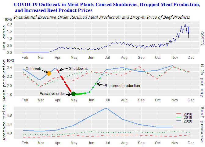
"How does the shortage of beef production rates during the COVID-19 pandemic affect the beef price?"
Created by Triveni Edla
These
projects were done in Fall 2020, so much of our discussion and examples
in class featured the COVID-19 pandemic. Triveni found an interesting
aspect to investigate -- the effect of the pandemic on meat processing
and beef prices. Triveni used several sources for her data, including The New York Times COVID data, the USDA's meat production data, the Food & Environment Reporting
Network and CDC to track outbreaks, the Meatpoultry website to track plant shutdowns, and the US Bureau of Labor Statistics to track beef product prices.
Triveni
used R to create this grid of line charts. The x-axis (time) was
aligned so that the viewer could compare the charts vertically to see
how the first increases in COVID cases corresponded to outbreaks and
shutdowns at meat processing plants that were then followed by increases
in beef prices, which fell as production resumed to pre-pandemic
levels.
"How have popular songs in key genres changed over time?"
Created by McKayla Hagerty
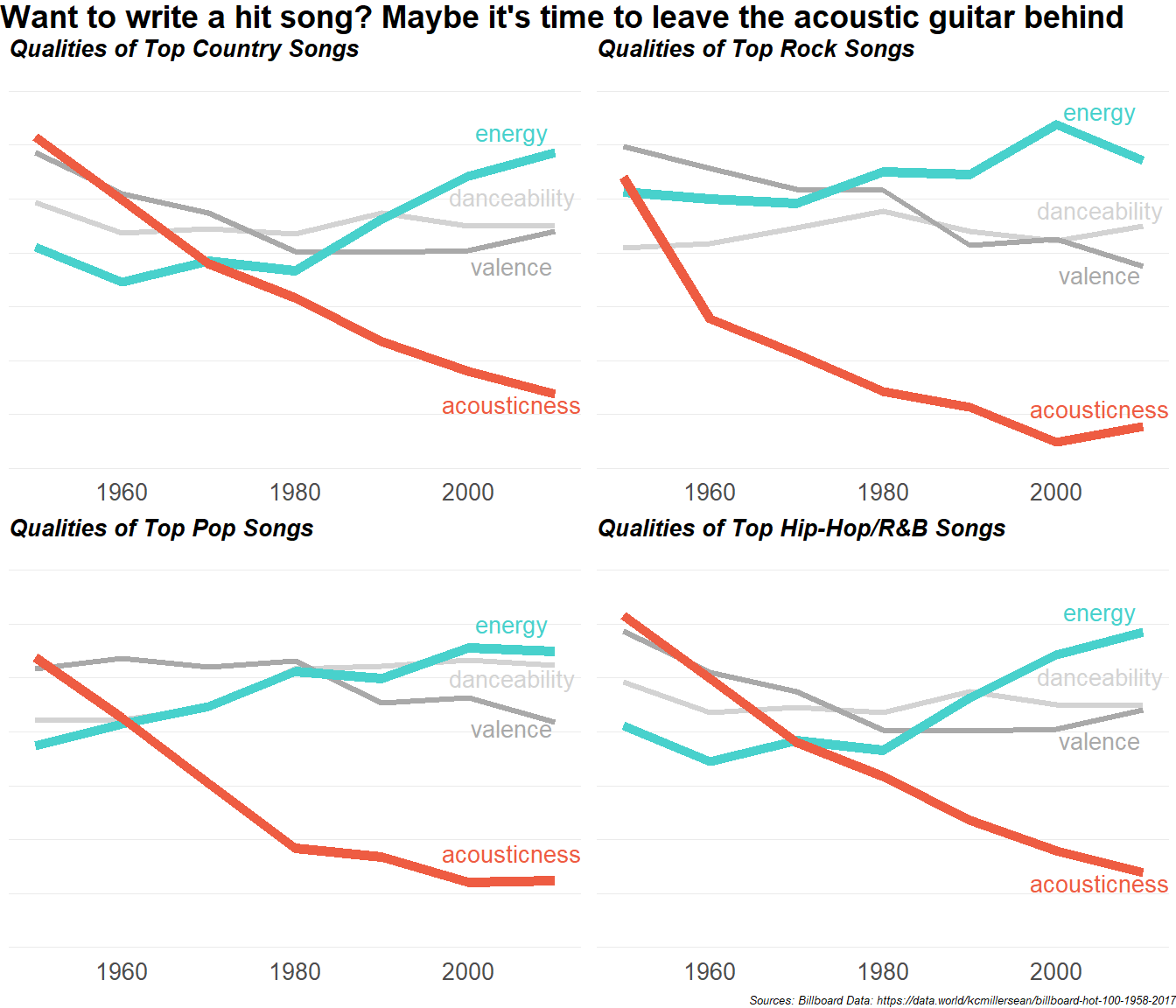
This
visualization explored how popular songs in key genres have changed
over time in terms of various musical characteristics. The data source
is Billboard's Weekly Hot 100 singles charts and included data from August 1958 to December 2019.
McKayla used R to create this grid of line charts and faceted the data
by four popular genres: country, rock, pop, and hip hop/R&B. In
each chart she showed how energy, danceability, valence, and
acousticness changed over the years.
McKayla reports:
Across all four included genres, the energy has increased and the acousticness has decreased. Country songs still have more acousticness than other genres but have also seen a steady decline in this quality. Country and Hip-Hop songs have seen a big increase in energy since 1980. To a lesser extent, the valence, or happiness, of top songs has decreased while danceability has remained consistent. Currently, pop songs are the most danceable songs and rock songs are the saddest.McKayla did a nice job of simplifying a very large dataset and focusing on a few interesting features. She also highlighted particular features that had changed a great deal over time. Finally, she wrote a headline that grabbed the viewers' attention and highlighted one of the main findings.
"Does education level within a country have an influence on a persons view of same-sex marriages?"
Created by Dalina Beckham
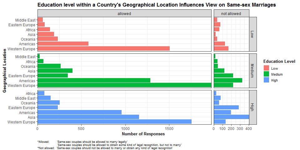
This visualization explored the relationship between views on same-sex marriage and education level in different areas of the world. The data came from BuzzFeed News' Same-Sex Marriage and Abortion Poll from 2015.
Dalina used R to create the chart, employing facets to compare the two main aspects of the dataset. The allowed/not allowed response for same-sex marriage was used to facet
the data horizontally, and education level was faceted vertically and
color-coded. In most cases, support for same-sex marriage was higher than opposition. At all education levels, those in Western Europe were more likely
than those in other regions to favor same-sex marriage, those in the Americas (including
South/Central/North America) were more likely than others to oppose
same-sex marriage at Medium levels of education, and those in Asia were more likely than others to oppose same-sex marriage at High levels of education.
Dalina created an easy to read visualization with a headline that expressed the main point of the chart, consistent coloring, a clean design, and included footnotes to provide additional information about the data.
-Michele
Comments
Post a Comment