2014-08-28: InfoVis 2013 Class Projects
(Note: This is continuing a series of posts about visualizations
created either by students in our research group or in our classes.)
I've been teaching the graduate Information Visualization course since Fall 2011. In this series of posts, I'm highlighting a few of the projects from each course offering. (Previous posts: Fall 2011, Fall 2012)
In Spring 2013, I taught an Applied Visual Analytics course that asked students to create visualizations based on the "Life in Hampton Roads" annual survey performed by the Social Science Research Center at ODU. In Fall 2013, I taught the traditional InfoVis course that allowed students to choose their own topics. (All class projects are listed in my InfoVis Gallery.)
Life in Hampton Roads
Created by Ben Pitts, Adarsh Sriram Sathyanarayana, Rahul Ganta
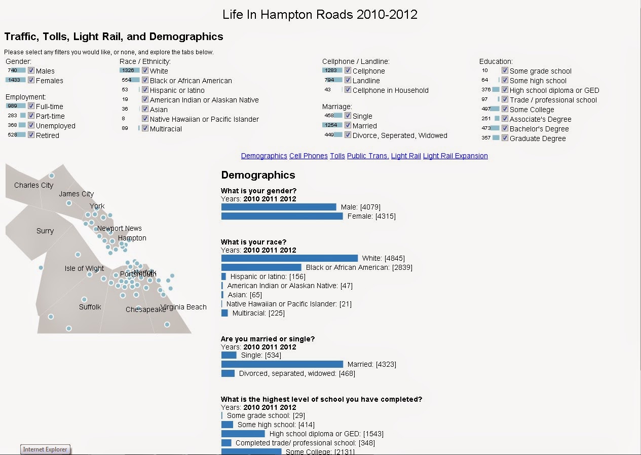
This project (currently available at https://ws-dl.cs.odu.edu/vis/LIHR/) provides a visualization of the "Life in Hampton Roads" survey for 2010-2012. Data cleansing was done with the help of tools like Excel and Open Refine. The results of the survey are shown using maps and bar charts, making it easier to understand public opinions on a particular question. Visualizations are created by using various tools like D3, Javascript, JQuery and HTML. The visualizations implemented in the project are reader-driven and exploratory. The user can interactively change the filters in the top half of the page and see the data only for the selected groups below.
The video below provides a demo of the tool.
MeSH Viewer
Created by Gil Moskowitz
 MeSH
is a controlled vocabulary developed and maintained by the U.S.
National Library of Medicine (NLM) for indexing biomedical databases,
including the PubMed citation database. PubMed queries can be made more
precise, returning fewer citations with higher relevance, by issuing
them with specific reference to MeSH terms. The database of MeSH terms
is large, with many interrelationships between terms. The MeSH viewer (currently available at https://ws-dl.cs.odu.edu/vis/MeSH-vis/) visually
presents a subset of MeSH terms, specifically MeSH descriptors. The
MeSH descriptors are organized into trees based on a hierarchy of MeSH
numbers. This work includes a tree view to show the relationships as
structured by the NLM. However, individual descriptors may have multiple
MeSH numbers, hence multiple locations in the forest of trees, so this
view is augmented with a force-directed node-link view of terms found in
response to a user search. The terms can be selected and used to build
PubMed search strings, and an estimate of the specificity of this
combination of terms is displayed.
MeSH
is a controlled vocabulary developed and maintained by the U.S.
National Library of Medicine (NLM) for indexing biomedical databases,
including the PubMed citation database. PubMed queries can be made more
precise, returning fewer citations with higher relevance, by issuing
them with specific reference to MeSH terms. The database of MeSH terms
is large, with many interrelationships between terms. The MeSH viewer (currently available at https://ws-dl.cs.odu.edu/vis/MeSH-vis/) visually
presents a subset of MeSH terms, specifically MeSH descriptors. The
MeSH descriptors are organized into trees based on a hierarchy of MeSH
numbers. This work includes a tree view to show the relationships as
structured by the NLM. However, individual descriptors may have multiple
MeSH numbers, hence multiple locations in the forest of trees, so this
view is augmented with a force-directed node-link view of terms found in
response to a user search. The terms can be selected and used to build
PubMed search strings, and an estimate of the specificity of this
combination of terms is displayed.
The video below provides a demo of the tool.
Visualizing Currency Volatility
Created by Jason Long
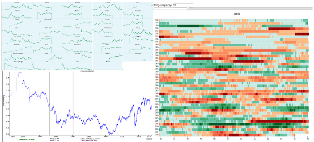
This project (currently available at https://ws-dl.cs.odu.edu/vis/currency/) was focused on showing changes in currency values over time. The initial display shows the values of 39 currencies (including Bitcoin) as compared to the US Dollar (USD). It's easy to see when the Euro was introduced and individual currencies in EU countries dropped off. Clicking on a particular currency expands its chart and allows for closer inspection of its change over time. There is also a tab for a heatmap view that allows the user to view a moving average of the difference from USD. The color indicates whether the USD is appreciating (green) or depreciating (red).
The video below provides a demo of the tool.
-Michele
I've been teaching the graduate Information Visualization course since Fall 2011. In this series of posts, I'm highlighting a few of the projects from each course offering. (Previous posts: Fall 2011, Fall 2012)
In Spring 2013, I taught an Applied Visual Analytics course that asked students to create visualizations based on the "Life in Hampton Roads" annual survey performed by the Social Science Research Center at ODU. In Fall 2013, I taught the traditional InfoVis course that allowed students to choose their own topics. (All class projects are listed in my InfoVis Gallery.)
Life in Hampton Roads
Created by Ben Pitts, Adarsh Sriram Sathyanarayana, Rahul Ganta
This project (currently available at https://ws-dl.cs.odu.edu/vis/LIHR/) provides a visualization of the "Life in Hampton Roads" survey for 2010-2012. Data cleansing was done with the help of tools like Excel and Open Refine. The results of the survey are shown using maps and bar charts, making it easier to understand public opinions on a particular question. Visualizations are created by using various tools like D3, Javascript, JQuery and HTML. The visualizations implemented in the project are reader-driven and exploratory. The user can interactively change the filters in the top half of the page and see the data only for the selected groups below.
The video below provides a demo of the tool.
MeSH Viewer
Created by Gil Moskowitz
The video below provides a demo of the tool.
Visualizing Currency Volatility
Created by Jason Long
This project (currently available at https://ws-dl.cs.odu.edu/vis/currency/) was focused on showing changes in currency values over time. The initial display shows the values of 39 currencies (including Bitcoin) as compared to the US Dollar (USD). It's easy to see when the Euro was introduced and individual currencies in EU countries dropped off. Clicking on a particular currency expands its chart and allows for closer inspection of its change over time. There is also a tab for a heatmap view that allows the user to view a moving average of the difference from USD. The color indicates whether the USD is appreciating (green) or depreciating (red).
The video below provides a demo of the tool.
-Michele
Comments
Post a Comment