2018-06-27: InfoVis Spring 2017 Class Projects
This may sound familiar, but yet again I'm way behind in posting about my previous offerings of CS 725/825 Information Visualization.
(Previous semester highlights posts: Spring 2016, Spring 2015, Spring/Fall 2013, Fall 2012, Fall 2011)
Here are a few projects that I'd like to highlight from Spring 2017. (All class projects are listed in my InfoVis Gallery. This semester has its own page because there were 19(!) projects.) All of the projects were implemented using the D3.js library.
Because the Spring 2017 semester began with President Donald Trump's Travel Ban (EO 13769) and we have a large international graduate student population, students were understandably interested in US immigration and refugee data. The first two projects here focus on that. In addition, one project looked at sentiment about the US Presidential candidates on social media on Election Day.
The last two projects that I'll highlight are focused on the lighter topic of sports, NFL football and IPL cricket.

This project focuses on refugee admittance to the US between 2008-2016. The visualization highlights the number of refugees by country of nationality/religion, and relationship between a country's number of refugees, number of war deaths, population, GDP per capita (GDPPC), and State Fragility Index (SFI).
Foreign Travel and Immigration to the US
Created by Hind Aldabagh and Bathsheba Nelson

This project (available at http://www.cs.odu.edu/~bnelson/cs725/project1/index.html) shows the total number of immigrants (2010-2015) from each region, country, and class of admission as well as the totals that settle in each state in the US. The visualizations include an interactive world map alongside a tabbed panel with various idioms (bar chart, line chart, choropleth map, text lists) to provide quick access to multiple views of immigration information.
Flash video available at http://www.cs.odu.edu/~haldabag/cs725/worldmap-template2/video.html
Sentiment Analysis Based on Social Media

This project (available at http://www.cs.odu.edu/~ttriveni/cs725/SentimentAnalysis/test.html) presents emotion and sentiment analysis of Tweets about the 2016 US Presidential candidates on Election Day. Visualization idioms include treemap, wordcloud, and US map.
Insights into American Football

This project presents a visualization interface to explore NFL football data over the past 10 years. Different idioms like multi-line chart, bar chart, radar and donut charts are used to visualize the football dataset, which aims at providing a platform for the users to help them explore and find some interesting insights that may go unnoticed.

This project visualizes statistics of the Indian Premier League (IPL) for all 9 seasons. It is concentrated on displaying complete information from a season to each ball in every match. The user is provided with performance rankings, points table for each season, and total scores of each match in a season. Upon comparing total runs in all matches played by a team in a season, the user can navigate to run-rate, loss of wickets, types of runs, batting/bowling stands in the selected match.
(Previous semester highlights posts: Spring 2016, Spring 2015, Spring/Fall 2013, Fall 2012, Fall 2011)
Here are a few projects that I'd like to highlight from Spring 2017. (All class projects are listed in my InfoVis Gallery. This semester has its own page because there were 19(!) projects.) All of the projects were implemented using the D3.js library.
Because the Spring 2017 semester began with President Donald Trump's Travel Ban (EO 13769) and we have a large international graduate student population, students were understandably interested in US immigration and refugee data. The first two projects here focus on that. In addition, one project looked at sentiment about the US Presidential candidates on social media on Election Day.
The last two projects that I'll highlight are focused on the lighter topic of sports, NFL football and IPL cricket.
Visualization of US Refugee Admittance Data
Created by Susan Zehra
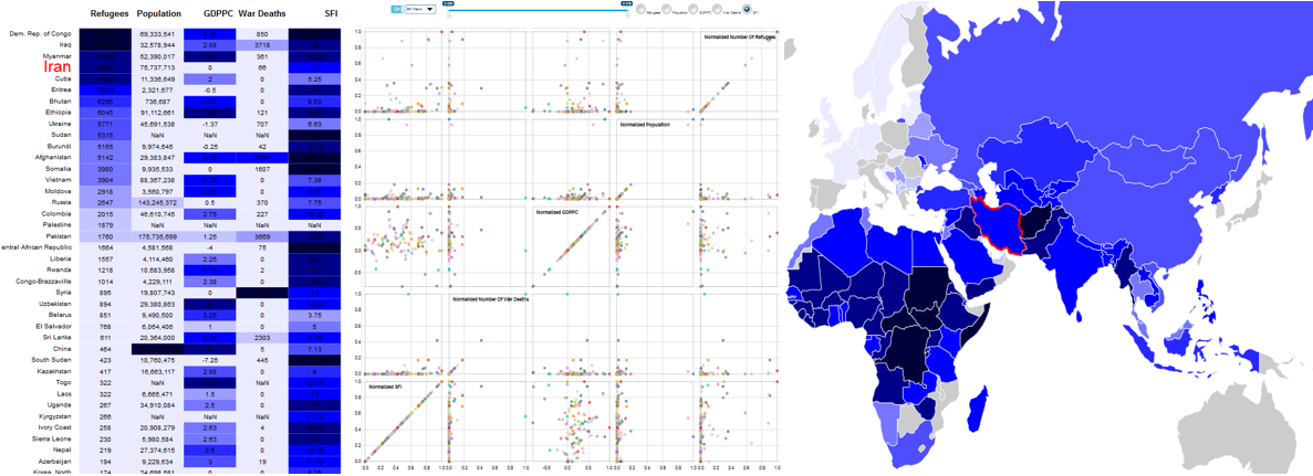
This project focuses on refugee admittance to the US between 2008-2016. The visualization highlights the number of refugees by country of nationality/religion, and relationship between a country's number of refugees, number of war deaths, population, GDP per capita (GDPPC), and State Fragility Index (SFI).
Foreign Travel and Immigration to the US
Created by Hind Aldabagh and Bathsheba Nelson
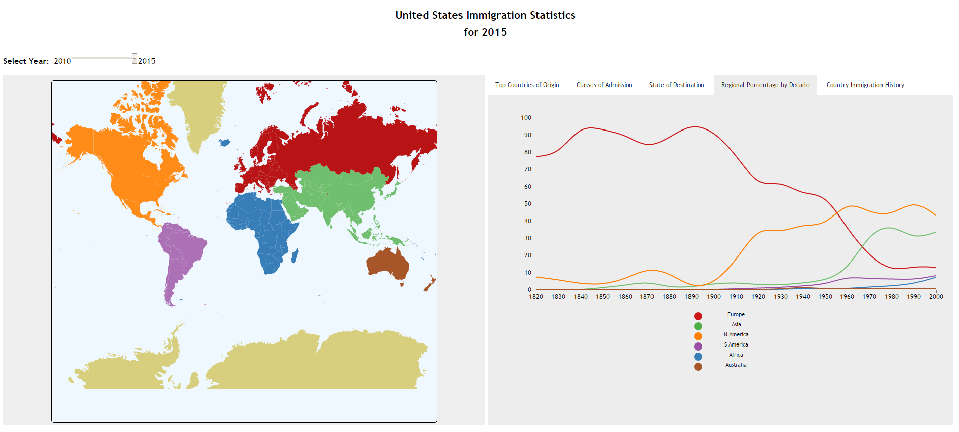
This project (available at http://www.cs.odu.edu/~bnelson/cs725/project1/index.html) shows the total number of immigrants (2010-2015) from each region, country, and class of admission as well as the totals that settle in each state in the US. The visualizations include an interactive world map alongside a tabbed panel with various idioms (bar chart, line chart, choropleth map, text lists) to provide quick access to multiple views of immigration information.
Sentiment Analysis Based on Social Media
Created by Triveni Bhardwaj
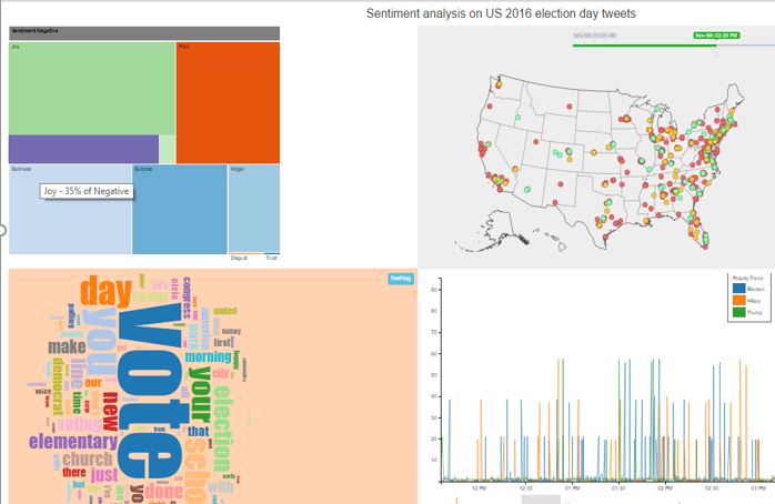
This project (available at http://www.cs.odu.edu/~ttriveni/cs725/SentimentAnalysis/test.html) presents emotion and sentiment analysis of Tweets about the 2016 US Presidential candidates on Election Day. Visualization idioms include treemap, wordcloud, and US map.
Insights into American Football
Created by Mahesh Kukunooru and Maheedhar Gunnam
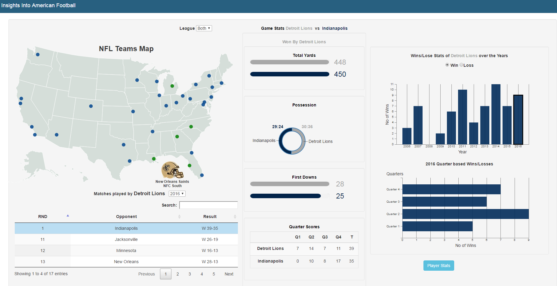
This project presents a visualization interface to explore NFL football data over the past 10 years. Different idioms like multi-line chart, bar chart, radar and donut charts are used to visualize the football dataset, which aims at providing a platform for the users to help them explore and find some interesting insights that may go unnoticed.
IPL - Indian Premier League
Created by Karan Balmaui and Varun Kumar Karne
Created by Karan Balmaui and Varun Kumar Karne
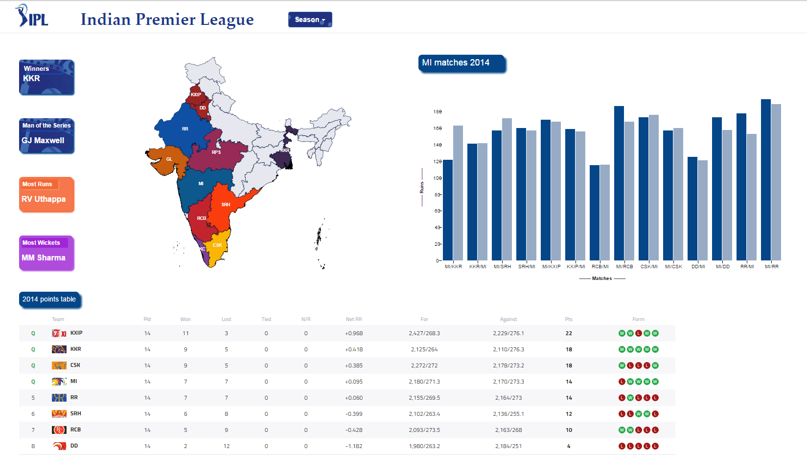
This project visualizes statistics of the Indian Premier League (IPL) for all 9 seasons. It is concentrated on displaying complete information from a season to each ball in every match. The user is provided with performance rankings, points table for each season, and total scores of each match in a season. Upon comparing total runs in all matches played by a team in a season, the user can navigate to run-rate, loss of wickets, types of runs, batting/bowling stands in the selected match.
-Michele
Comments
Post a Comment