2018-07-11: InfoVis Fall 2017 Class Projects
(Previous semester highlights posts: Spring 2017, Spring 2016, Spring 2015, Spring/Fall 2013, Fall 2012, Fall 2011)
Here are a few projects that I'd like to highlight from Fall 2017. (All class projects are listed in my InfoVis Gallery.) All of the projects were implemented using the D3.js library.
World Leader Interactions on Social Media (Twitter)
Created by Grant Atkins
 This project (available at http://www.cs.odu.edu/~gatkins/world-leader-vis/app/) provides an interactive dashboard to visualize ways Twitter list data can be used and represented. This
visualization uses the World Leaders list on Twitter, with the
addition of a few world leaders not on the list, to derive information
and visualize shared information among these users. The goal of this
visualization is to show shared term usage among world leaders, see
which times tweets are more likely to be sent out, the sentiment of the
users, and the decay of data allocated in a static decreasing time
interval.
This project (available at http://www.cs.odu.edu/~gatkins/world-leader-vis/app/) provides an interactive dashboard to visualize ways Twitter list data can be used and represented. This
visualization uses the World Leaders list on Twitter, with the
addition of a few world leaders not on the list, to derive information
and visualize shared information among these users. The goal of this
visualization is to show shared term usage among world leaders, see
which times tweets are more likely to be sent out, the sentiment of the
users, and the decay of data allocated in a static decreasing time
interval.
Investigation Into Cryptocurrency Pricing Patterns With Respect to Financial Instability
Created by Jason Orender

This project (available at http://www.cs.odu.edu/~jorender/cs725/CS725-PROJECT_Y9FziL/) provides a focused presentation of the world events co-incident with spikes in peer-to-peer cryptocurrency transactions together with a continuous evolutionary timeline to provide perspective regarding the state of development and usage at a national, regional and worldwide level. Bitcoin was the sole cryptocurrency used in this analysis due to the large amount of country specific peer-to-peer data available.
Holiday Flight Patterns

This project (available at http://www.cs.odu.edu/~agosav/cs725/HolidaysFlightPattern/index.html) is an interactive tool for visualizing holiday flight patterns using a dot chart to visualize the last year's data, a US map with bubbles to display the average arrival delay at particular airports, and a line chart which shows the monthly distribution from 2006-2015. The datasets selected for this visualization are the percentage of on-time arrival, delayed and cancellations for different airlines operating in the US, over different years. The intention was to find flight delay patterns between holiday and non-holiday months.
Sports Injuries

This project (available at http://www.cs.odu.edu/~pvargas/cs725/cs725-project/) deals with an organization interested in reducing the number of personnel injuries due to the dangerous nature of their job, and looks into a more effective visualization technique that measures its physical performance training program. The goal of the visualization project is to provide answers specific to the organization in terms of identifying where most injuries occur, which activities are injury-prone, correlation of injuries with the training program, and the evaluation and trends of its members physical training performance.

This project (available at http://www.cs.odu.edu/~jashley/cs725/project/) highlights some of the characteristics that make up the current Federal civil service workforce. The visualization also provides a visual snapshot of how widely dispersed the workforce is.
Video available at http://www.cs.odu.edu/~jashley/cs725/demo/
-Michele
Here are a few projects that I'd like to highlight from Fall 2017. (All class projects are listed in my InfoVis Gallery.) All of the projects were implemented using the D3.js library.
World Leader Interactions on Social Media (Twitter)
Created by Grant Atkins

Investigation Into Cryptocurrency Pricing Patterns With Respect to Financial Instability
Created by Jason Orender
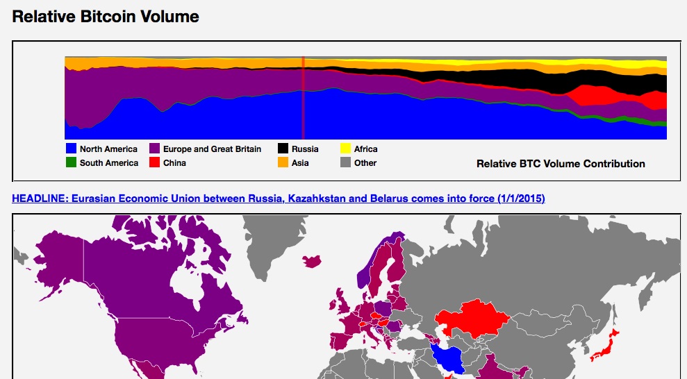
This project (available at http://www.cs.odu.edu/~jorender/cs725/CS725-PROJECT_Y9FziL/) provides a focused presentation of the world events co-incident with spikes in peer-to-peer cryptocurrency transactions together with a continuous evolutionary timeline to provide perspective regarding the state of development and usage at a national, regional and worldwide level. Bitcoin was the sole cryptocurrency used in this analysis due to the large amount of country specific peer-to-peer data available.
Holiday Flight Patterns
Created by Asmita Gosavi
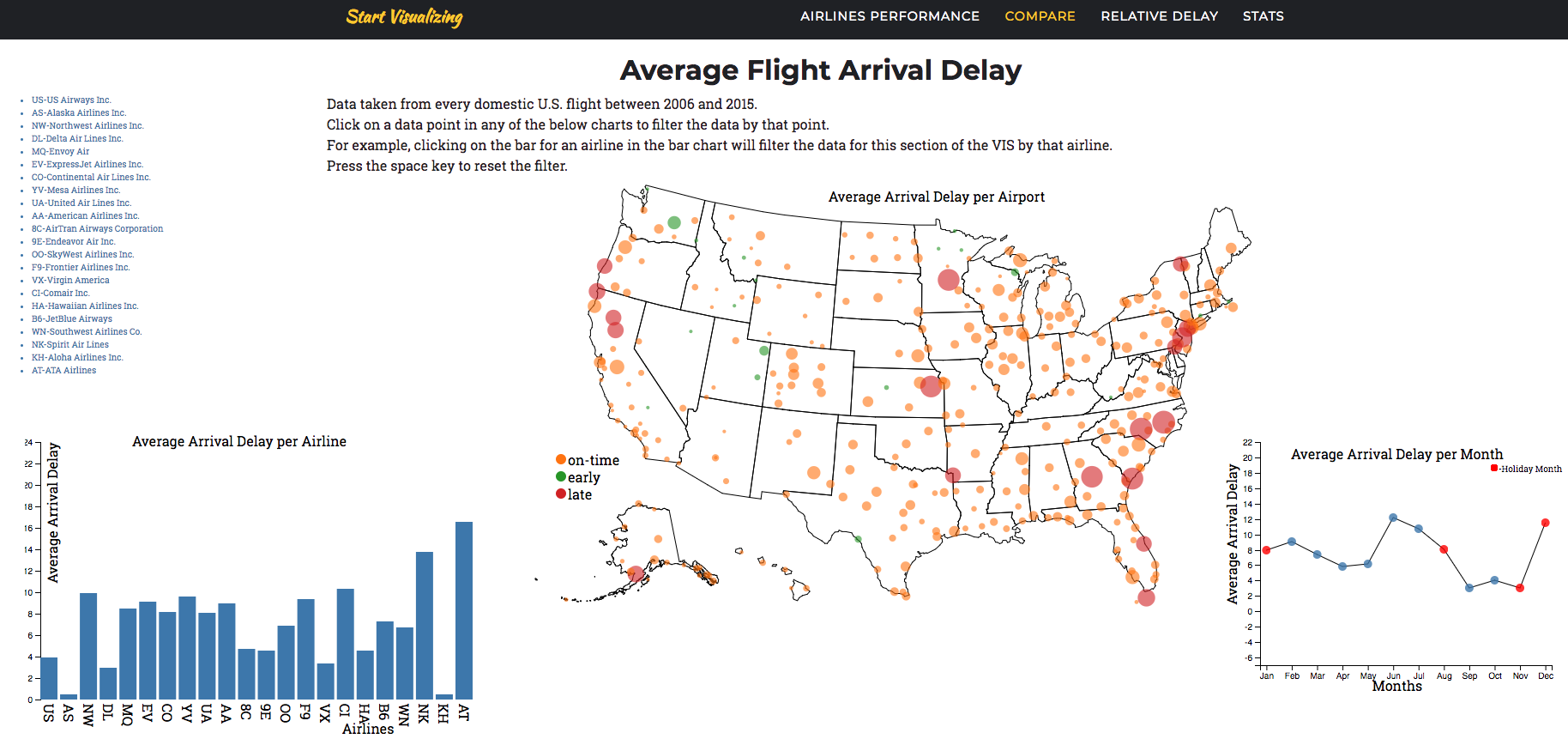
This project (available at http://www.cs.odu.edu/~agosav/cs725/HolidaysFlightPattern/index.html) is an interactive tool for visualizing holiday flight patterns using a dot chart to visualize the last year's data, a US map with bubbles to display the average arrival delay at particular airports, and a line chart which shows the monthly distribution from 2006-2015. The datasets selected for this visualization are the percentage of on-time arrival, delayed and cancellations for different airlines operating in the US, over different years. The intention was to find flight delay patterns between holiday and non-holiday months.
Sports Injuries
Created by Plinio Vargas and Miranda Smith

This project (available at http://www.cs.odu.edu/~pvargas/cs725/cs725-project/) deals with an organization interested in reducing the number of personnel injuries due to the dangerous nature of their job, and looks into a more effective visualization technique that measures its physical performance training program. The goal of the visualization project is to provide answers specific to the organization in terms of identifying where most injuries occur, which activities are injury-prone, correlation of injuries with the training program, and the evaluation and trends of its members physical training performance.
Federal Workforce
Created by John Ashley
Created by John Ashley
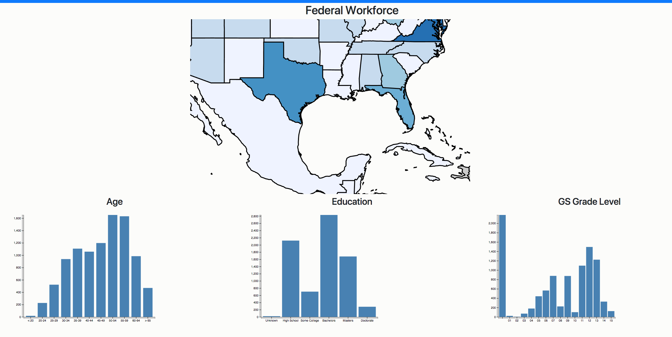
This project (available at http://www.cs.odu.edu/~jashley/cs725/project/) highlights some of the characteristics that make up the current Federal civil service workforce. The visualization also provides a visual snapshot of how widely dispersed the workforce is.
-Michele
Comments
Post a Comment