2022-12-02: Visualization Class Projects - 2021-2022
CS 725/825 - Spring 2021
In 2019, I was asked to develop a 600-level data visualization course to be part of the core requirements for ODU's MS in Data Science and Analytics program. Since this new course could cover the basics of data visualization theory, I was able to adapt my existing CS 725/825 Information Visualization course to include more advanced topics, which also allowed it to serve as an elective in the Artificial Intelligence and Machine Learning concentration of the new MS program. With these changes, we also updated the name and course description:
CS 725/825: Information Visualization and Visual Analytics
This course covers the theory and application of information visualization and of visual analytics, the science of combining interactive visual interfaces and information visualization techniques with automatic algorithms to support analytical reasoning through human-computer interaction. Research on visual perception, cognition, interactive visual interfaces, and visual analytics will be covered. Practical techniques for the display of complex multivariate data will be addressed. Course projects will require the development of interactive web-based interfaces to analyze and visualize real-world datasets.
Spring 2021 was the first time I offered this updated version of the course. We focused on using Vega-Lite and D3 to handle complex data, and students built interactive dashboards for their final projects.
The final project assignment instructions were to "choose a real-world dataset and develop an interactive dashboard visualization that allows users to better understand the data, such as by discovering patterns, identifying outliers, confirming or rejecting hypotheses, etc." I'll highlight three of the top projects here.
A look at video games with sales greater than 100,000 copies from 1980 to 2016
Created by Abigail Mabe
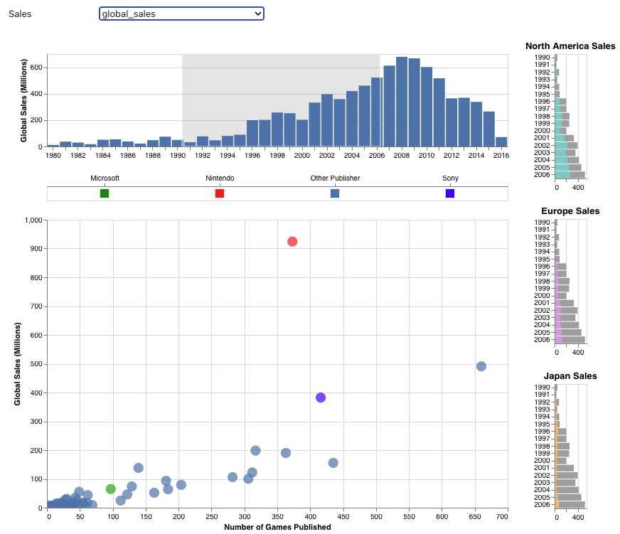
Demo: https://observablehq.com/@a-mabe/video-game-sales
Abigail chose to look at the topic of video game sales. Her dataset came from Kaggle, based on webscraping from http://www.vgchartz.com/
The dashboard, developed in Vega-Lite, features a main scatterplot showing number of games published (x-axis) vs. global sales (y-axis). The dots are colored based on the game manufacturer (Microsoft, Nintendo, Sony, and other). The histogram at the top shows the total global sales over time and is a scented widget, meaning that it provides information about the underlying data and can also be used to filter the data. In the image above, I've filtered to show only data between 1991-2006. The filtering also affects the side bar charts, which show proportion of total sales that are from North America, Europe, and Japan over time.
Using this dashboard, Abigail made the following findings:
- Nintendo has the highest sales, and this remains true for different regions and most years.
- Sony and Microsoft don't have the same high sales as Nintendo even though they also produce gaming consoles.
- The correlation between number of games published and sales changes by region.
- Sales by region have changed over the years.
Abigail had several nice touches on this dashboard, including the small multiples breakdown of sales by region, use of color to highlight the top manufacturers, and the use of brushing and linking to filter the data displayed both in the scatterplot and in the small multiples.
Analyzing performance and eye-movement data of young adults with ADHD
Created by Gavindya Jayawardena
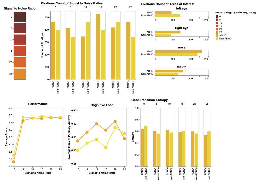
Demo: https://observablehq.com/@gavindya/cs-825-spr21-final-visualization-project
Gavindya chose to use data from her PhD research on the performance and eye-movement data of young adults with ADHD compared to age-matched young adults without ADHD during an audiovisual Speech-In-Noise task.
This dashboard was developed using Vega-Lite and consists of three bar charts (two vertical and one horizontal) and two-line charts that allow users to compare ADHD and Non-ADHD groups of the study in terms of fixation count on different SNRs, fixation count on different AOIs (areas of speaker's face), performance (score) on different SNRs, gaze transition entropy on different SNRs, and cognitive load on different SNRs.
Some of the findings that Gavindya made with this dashboard were:
- Fixation count on all regions of ADHD group significantly differed compared to other SNRs
- Cognitive load between ADHD and Non-ADHD groups differed significantly, such that the ADHD group had a higher cognitive load.
- Performance of ADHD group was less compared to Non-ADHD group.
In addition to Vega-Lite, Gavindya used D3/SVG in part of this dashboard to assist with filtering the data. And the data is further able to be filtered using the SNR boxes (clickable). She also included tooltips so that hovering over data points reveals more information about the underlying data.
Voter fraud claims on Twitter after the 2020 US Election
Created by Himarsha Jayanetti
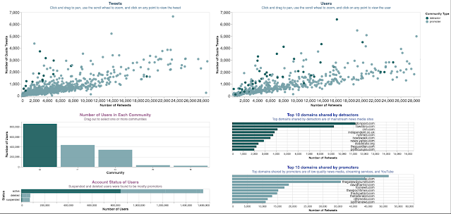
Demo: https://observablehq.com/@himarshaj/part-2-dashboard
Himarsha chose to analyze Twitter data from the 2020 Election with key phrases and hashtags related to voter fraud. She used the VoterFraud2020 dataset compiled by the Jacobs Technion-Cornell Institute at Cornell Tech.
The dashboard was developed in Vega-Lite and consists of two main scatterplots and four bar charts. The scatterplots show the number of tweets (left) and number of users (right) based on retweets vs. quote tweets. The dots are colored based on whether the tweet/user was classified as a detractor or promoter of voter fraud. Clicking on a dot loads the tweet or user account page that was selected. The bar charts show the number of users in each community (as classified by the dataset), top 10 domains shared by detractors, top 10 domains shared by promoters, and account status of the users (active, deleted, or suspended).
Using this dashboard, Himarsha made the following findings:
- The most popular users among promoters were realDonaldTrump (suspended), LLinWood (suspended), SidneyPowell1 (suspended), GenFlynn suspended (suspended)
- The most popular users among detractors were kylegriffin1 (active), mmpadellan (active), donwinslow (active), BernieSanders (active), AriBerman (active)
- Suspended users were found to be mostly promoters.
- Among all the URLs shared in tweets, the domains that were mostly shared by users in the detractor clusters are of mainstream news media, such as the Washington Post, CNN, and the New York Times.
- The domains shared by users in the promoter clusters were mostly from low-quality news-related websites, streaming services, and YouTube videos.
Himarsha did a nice job of using color consistency throughout her dashboard. She also provided instructions for users on how to interact with the charts, and linked the scatterplot points to Twitter to allow users to investigate particular tweets and accounts.
CS 625 - Fall 2021
Fall 2021 was the third (and most recent) time that I'd taught CS 625, so I felt that I was getting the hang of it and communicating better what I wanted from the final assignments. This was also the largest class of the three, with a total of 34 students (with over half online). This time I split the final visualization into three separate assignments:
- HW6 - initial dataset exploration
- HW7 - generate in-depth questions using exploratory data analysis
- HW8 - implement final chart
The end goal is to produce a static explanatory visualization that reveals some interesting relationship between two datasets. Students also created a 5-minute demo video that walked through and explained their final visualization. Three of the top visualizations are highlighted here.
Created by Joshua Murphy
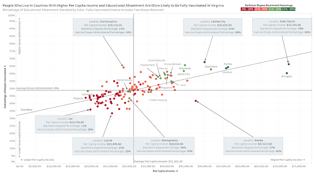
Joshua used Tableau to create an annotated scatterplot that looked at COVID-19 vaccination rates (y-axis) in counties in Virginia and compared that to the counties' per-capita income (x-axis) and Bachelors Degree attainment rate (dot color). He used two datasets: COVID-19 data from the Virginia Department of Health and economic and educational data from the US Census Bureau.
He found an upward trend regarding counties with higher per capita income rates, and vaccination doses administered. As the x-axis increases, the counties tend to be higher on the y-axis, which indicates a positive relation. He also found a positive relation between Educational Attainment levels and doses administered per county, as majority of the top counties the state in vaccinations are states that are above the 40% range (green in color hue) in educational attainment.
Joshua made great use of color and annotations in his chart. He used color hue to divide between 0-40% and 40-80% Bachelor's Degree Attainment. He added references lines on the x and y axes to indicate the average values for those metrics. And he used textboxes and arrows to point out counties that were outliers.
Created by Elizabeth Trahadias

Elizabeth used R to create her chart looking into the effects of temperature on honey bee colonies in Virginia. Her two datasets came from honey bee surveys from the USDA and temperature data from NOAA.
She found that in Virginia the number of bee colonies is declining, and the spikes in the state’s average temperature prompt further declines in the bee population.
Elizabeth did a great job combining the datasets and using them to answer her initial question. She added annotations to the chart to highlight interesting points and add context. She noted that she used Powerpoint to add the annotations, but since she matched the font type, you can't tell!
Created by Emily Escamilla

Emily used Vega-Lite to create these charts showing how NFL teams fared over three seasons based on the number of weeks starters were injured. Emily used multiple datasets from Pro Football Reference to address her question about how injuries affect NFL teams.
Emily found that overall playoff teams have the fewer injuries to starters. However, she found that in 2018 and 2019, the Patriots over-performed based on their number of injuries, but not in 2020. One difference was that in 2018 and 2019, they still had QB Tom Brady, while in 2020 he had moved to the Buccaneers, who then won the Super Bowl.
Emily did a nice job in the use of color and grouping to make the points in her charts. She sorted teams by injuries, but did so within the success groupings of Super Bowl, Division Winner, Wild Card, and Missed Playoffs. She also added highlighting to show the Patriots' bar, as the finding regarding Tom Brady was an interesting point.
CS 725/825 - Spring 2022
The most recent offering of CS 725/825 was in Spring 2022. Like with the previous offering of the course, students had to build an interactive dashboard visualization on a topic of their choice using either Vega-Lite or D3. Here are two of the top projects.

Demo: https://observablehq.com/d/01313a4a164aeb21
Lesley used both Vega-Lite and D3 to create this dashboard to analyze data about computer science faculty in the US. She was interested in differences between the number of male and female PhD graduates as well as faculty in these departments.
Charts include the percent of women among PhD students, graduates, and faculty at the selected university, how the breakdown of male/female PhD graduates compares with the national average, and a scatterplot comparing the percentage of female alums with the percentage of female faculty.
Lesley did a great job in integrating D3 and Vega-Lite in the same dashboard and displayed lots of data in a clean and understandable way.
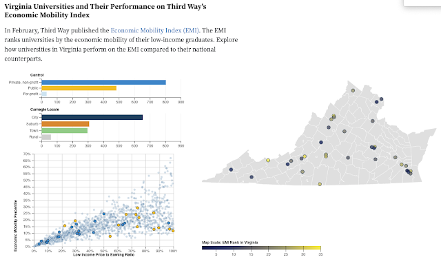
Demo: https://observablehq.com/d/1252795f253edb2b
Kimberly used D3 to implement this dashboard that allows users to explore how universities in Virginia perform on the Economic Mobility Index compared to other universities in the US.
The scatterplot comparing each university's economic mobility percentile with its low income price to earning ratio is brushable with the selection affecting the bar charts above showing the number of universities in the private/public/for-profit categories and their locations in terms of city/suburb/town/rural. The dots in the scatterplot are colored according to the private/public/for-profit range and the dots on the map are colored based on the university's EMI rank in Virginia. The dots on both charts have tooltips with more information that appear upon hovering.
Kimberly's initial dataset was large, and she did a good job in filtering what to show to highlight the interesting points. She also was able to implement the Virginia map in D3 and place the university locations on the map.
Summary
-Michele
Comments
Post a Comment