2021-02-25: Computation + Journalism 2021 Trip Report

One year ago, I was eagerly anticipating a trip to Boston in mid-March to attend the Computation + Journalism (C+J) Symposium 2020 hosted by Northeastern University. Our PhD student Alexander Nwala would be presenting a poster on his Storygraph work, and I was especially looking forward to the keynote addresses, in particular one from Amanda Cox, whose work I've highlighted in my Information Visualization courses for several years. Unfortunately, this was the first of several conferences for me to be impacted by the coronavirus pandemic. So, I was thrilled that the organizers decided to revive the 2020 program as a virtual symposium this year (program and schedule). Videos are promised, and I'll update this post when that's available. [5/7/21: Recordings of the keynote speakers and panels are now available!]
Some statistics from Computation+Journalism 2021 - A total of 879 people attended at least some part of the day, with a maximum of 415 people at any one time. The average time an attendee spent at the conference was 2 hours and 17 minutes. #cplusj21 @BrownInstitute @Northeastern pic.twitter.com/4sC8CZTyap
— Mark Hansen (@cocteau) February 22, 2021
Several of our WS-DL group members attended C+J 2021 on Friday, February 19, 2021 (thanks for the free registration!). The symposium was hosted on the ohyay.co platform, which provided an interesting interaction experience. One of the most noticeable features was that virtual applause was audible, which was remarked on by several speakers.
I am loving this conference platform.
— Dr Bahareh Heravi 🚧 (@Bahareh360) February 19, 2021
👋🏼 @merbroussard #CJ2021 pic.twitter.com/c8wNgHosjF
One side-effect of the symposium being postponed for almost a whole year (and that year being fairly eventful) was that the program of papers and contributed talks was heavily related to COVID and the 2020 US Presidential Election, but those major stories did shape much of journalism in 2020.
Besides the keynotes and invited panels, the remaining content was held in parallel sessions. The biggest problem I had during the entire symposium was in deciding which sessions to attend; they all contained interesting work. I didn't take comprehensive notes, but I'll briefly link to the work from some of the sessions that I was able to catch. And I'll include some screenshots and tweets related to what I saw. In addition to these, there was good activity on Twitter at the #CJ2021 and #cplusj21 hashtags.
Current frustration with #CJ2021 ... too many parallel sessions and I want to be in all of them :-/
— Nick Diakopoulos (@ndiakopoulos) February 19, 2021
Keynote I
The program kicked off with a keynote from Amanda Cox, editor of The New York Times's The Upshot section and former graphics editor at the NYT. Her talk focused on uncertainty in data and on the challenges in presenting uncertainty in data via visualizations to readers of The New York Times.
Yes! I think we should start with some art, says @amandacox, @UpshotNYT editor, at the opening keynote of this year's Computation + Journalism Symposium. #CJ2021 pic.twitter.com/zhl3PGgHsr
— Aleszu Bajak (@aleszubajak) February 19, 2021
We'd rather have the approximate answer to the right question than the right answer to the wrong question. @amandacox #CJ2021
— Rachel Kalmar (@grapealope) February 19, 2021
@amandacox talking about representing uncertainty in data at the nyt for #CJ2021 today (and yes, she talked about the needle!). I'm not mad at the UI that makes it feel like I'm watching an instagram live. pic.twitter.com/6TkQbXBUaS
— Marianne Aubin Le Quéré (@marianneaubin) February 19, 2021
Some of the most revelatory journalism is about understanding that people close to us don't understand the world in the same way. @amandacox #CJ2021
— Rachel Kalmar (@grapealope) February 19, 2021
Session I
Rob Wells, Katy Seiter, Mary Hennigan, Arkansascovid: How We Ran A COVID News Website Through a College Journalism Class - ArkansasCovid.com (@arkansascovid)
This was impressive work developed by a college journalism class. The two student co-authors are now Assistant Editors for Arkansascovid.com. See https://arkansascovid.com/about-2/ for more information on how this came about.
Derek Kravitz (@derekkravitz), Georgia Gee, Kyra Senese, Documenting COVID-19, collecting unstructured and confidential data from FOIA - https://documentingcovid19.io
Anyone can use the Documenting COVID-19 website to search state documents related to the pandemic obtained through open records laws and FOIA requests.
Alexander Nwala (@acnwala), Michele C. Weigle (@weiglemc), Michael L. Nelson (@phonedude_mln), 365 Dots in 2018, 2019, and 2020: Quantifying Attention of News Sources (slides, @storygraphbot)
Our work on Storygraph was presented both in Session I and also during the poster session. We were grateful for the multiple opportunities to talk about this work with attendees.
Happy to present our (@weiglemc @phonedude_mln) work @ Computation+Journalism 2021: https://t.co/2Blt0gG3gW@storygraphbot quantifies attention as a primitive for studying new dynamics
— Alexander C. Nwala (@acnwala) February 19, 2021
2018: https://t.co/1bHKjH3ODd
2019: https://t.co/qhpxkZTH4S
2020: https://t.co/vwXxDF2JRH pic.twitter.com/hHVfo5JXe4

in addition to @storygraphbot, @acnwala's work on Storygraph forms the basis for his work with @shawnmjones's daily summary of top news. Follow @StormyArchives for a daily summary.#CJ2021
— Michael L. Nelson (@phonedude_mln) February 19, 2021
@acnwala presented at #CJ2021 on "365 Dots in 2018, 2019, and 2020: Quantifying Attention of News Sources", analyzed using @storygraphbot. Impressive work! pic.twitter.com/sI1WG5wIno
— Himarsha Jayanetti (@HimarshaJ) February 19, 2021
Keynote II
The second keynote was from Deen Freelon (@dfreelon), Associate Professor in the UNC Hussman School of Media and Journalism. I liked the idea of these personalized filter maps to assess the state of your own filter bubble. The chart below plots ideology from left to right on the x-axis (and also on a blue-red color scale), "truth score" on the y-axis (higher is better), and sizes the dots by frequency.

Posters
I missed the Session II presentations because I spent my time chatting with folks in the poster session.
Nick Hagar, Jack Bandy, Daniel Trielli, Yixue Wang, Nicholas Diakopoulos, Defining Local News: A Computational Approach
This work looked at classifying news outlets as local, regional, or national based on the outlet's follow count by distance from the origin of the outlet. This could have applications for detecting "pink slime" local news outlets. This work also reminded me of Alexander Nwala's work on the Local Memory Project and its associated dataset of US and international local news outlets.
Priyanka Nanayakkara and Jessica Hullman, Toward Better Communication of Uncertainty in Science JournalismGood morning! If you're at #CJ2021, stop by the poster session at noon (EST) to hear about the Computational Journalism Lab's work defining local news https://t.co/TMiNhFnJUF pic.twitter.com/3tR9v2jeaI
— Nick Hagar (@NickHagar) February 19, 2021
Shun Yamaya, Saumya Bhadani, Filippo Menczer, Brendan Nyhan, Giovanni Luca Ciampaglia, Political audience diversity and news quality
Invited Panel I
Invited Panel I
David Byler (@databyler), Micah Cohen (@micahcohen), Natalie Jackson (@nataliemj10), Nick Diakopoulos (@ndiakopoulos), Political Forecasting Meets Journalism
This panel of journalists and researchers from The Washington Post, FiveThirtyEight, PRRI (Public Religion Research Institute), and Northwestern provided great insight into how journalists interact with and interpret political forecasting.
Election forecasting panel at #CJ2021 starting now! https://t.co/Ns2srvkrfe @ndiakopoulos @micahcohen @nataliemj10 @databyler pic.twitter.com/2JPOk3gVgE
— Jessica Hullman (@JessicaHullman) February 19, 2021
Listening to @nataliemj10 at #CJ2021 talking about gatekeeping, polls, and forecasting. "We need to drop the veneer of this being a strictly scientific exercise."
— Dr. Jena Barchas-Lichtenstein (@drNYCnerd) February 19, 2021
As human beings, we really struggle with uncertainty. People just want something that tells them what the future looks like. @nataliemj10, on political forecasting #CJ2021
— Rachel Kalmar (@grapealope) February 19, 2021
Session III
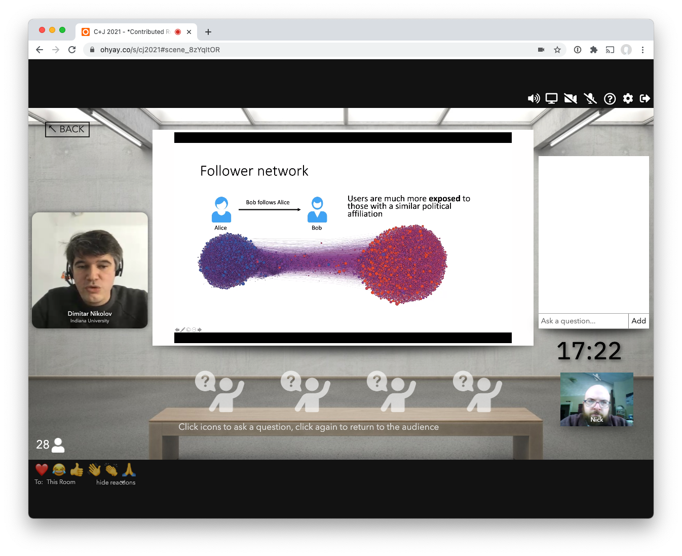
Dimitar Nikolov, Alessandro Flammini, Filippo Menczer, Right and left, partisanship predicts (asymmetric) vulnerability to misinformation (@OSoMe_IU)
This work investigated if personal partisanship predicted a user's likelihood to share misinformation. They asked "are highly partisan users more likely to share misinformation?" and "are users in echo chambers more likely to share misinformation?". Indeed, they found that degree of partisanship can predict vulnerability to misinformation.

Paper Panel III
Leonard Bronner (@lennybronner), Al Johri (@aljohri) and Jeremy Bowers (@jeremybowers). Predicting Elections using Live Data at The Washington Post
Data scientists and engineers from The Washington Post presented their work on forecasting voter turnout during an election. Before being used in the 2020 general election, it was tested on the 2019 Virginia House of Delegates and state Senate elections.

I'll be at Computation+Journalism today (9:45-6pm) to present our general election model (2:30-3:30pm) and talk about how our model performed during election week.
— Lenny Bronner (@lennybronner) February 19, 2021
Joining the conference is free, you just need to register here: https://t.co/iKTZIwbrvu#CJ2021 pic.twitter.com/RNZ4ElhQHI
Keynote III
The final keynote was delivered by David Rothschild (@DavMicRot), an economist at Microsoft Research. His talk was "Polling, Misinformation, and the Mainstream Media" and focused on the 2020 Election. I appreciated his cautions against "horserace coverage", the focus on which has been driving me crazy for the past few years. Another major point he made was that if you're worried about misinformation/disinformation, don't just focus on social media -- mainstream news plays an important role, too.


@DavMicRot misinterpretation on polling drives elite decision making—Obamacare is a great example of this. Asking *why* not just *what* are the opinions empowers populations. #CJ2021
— Aspen (@aspenkhopkins) February 19, 2021

Session IV
Dylan Halpern (@dchalpern), Marynia Kolak, Xun Li, Qinyun Lin, Visualizing the Pandemic: 1 Year Later - https://theuscovidatlas.org
The group from The Center for Spatial Data Science at the University of Chicago talked about their work on the US COVID Atlas, presenting up-to-date and historical data on the COVID pandemic in the US, including state and county-based data cases, deaths, testing, and now vaccinations.
Invited Panel II
Jen Christiansen (@ChristiansenJen), Catherine D’Ignazio (@kanarinka), Jessica Hullman (@JessicaHullman), Alberto Cairo (@AlbertoCairo), Conveying a Clear Message and Uncertainty with Graphics
The conference wrapped up with a terrific panel on conveying uncertainity in graphics. I agree with the tweet below -- when the video comes out, make sure to watch this one!


This session "Conveying a Clear Message and Uncertainty with Graphics" was fantastic. If it's recorded somewhere, I definitely recommend watching it. @JessicaHullman @ChristiansenJen @kanarinka are doing really important work! #CJ2021 pic.twitter.com/hIMhUbTbAK
— Rachel Kalmar (@grapealope) February 19, 2021
Part of the problem with visualizing uncertainty is that the visualization itself conveys fact. @JessicaHullman #CJ2021 pic.twitter.com/1hm58QWVkR
— Rachel Kalmar (@grapealope) February 19, 2021
This was a great conference with interesting talks that highlighted the impact that computation and visualization can have "in the real world". I've always been interested in how people take in new information, and the combination of computer science and journalism is an exciting intersection for me. I'll definitely keep an eye out for this series in the future.The more we practice addressing uncertainty head-on, the more comfortable we'll get with representing it. @ChristiansenJen #CJ2021 pic.twitter.com/uF45Sn2JES
— Rachel Kalmar (@grapealope) February 19, 2021
Comments
Post a Comment